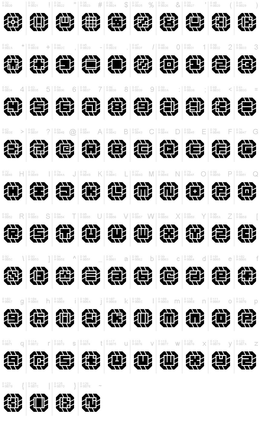
Might Chain Regular
TrueTypeFreeware
might-chain.ttf
Tags
Nota do autor
Some kind of great big ol' chain!
When glyphs are used in isolation, they somewhat resemble carved signets or seals. Increasing the letter spacingallows you to create a variation of the design. (This is something that must be done in-software since the font will render as monospaced by default.)
When glyphs are used in isolation, they somewhat resemble carved signets or seals. Increasing the letter spacingallows you to create a variation of the design. (This is something that must be done in-software since the font will render as monospaced by default.)
Mapa de caracteres
Porfavor use o menu suspenso para ver os diferentes mapas de caracteres contidos nesta fonte.

Informaçőes de fontes básicas
Nota de direitos autorais
Copyright zephram 2018
Família da fonte
Might Chain
Subfamília da fonte
Regular
Identificação única da subfamília
Might Chain
Nome completo da fonte
Might Chain Regular
Versão da tabela de nomes
Version 1.0
Nome da fonte do postscript
Might-Chain
Nota da marca registrada
FontStruct is a trademark of FontStruct.com
Nome do fabricante
Designer
Descriçăo
“Might Chain” was built with FontStruct
Designer description: Some kind of great big ol' chain.
In retrospect, I think it looks like a jewelry chain from a dwarven civilization. Perhaps the hypothetical jeweler cut and ground the stones in an imitation of some dwarven font!
When glyphs are used in isolation, they somewhat resemble carved signets or seals. Increasing the letter spacing allows you to create a variation of the design. (This is something that must be done in-software since the font will render as monospaced by default.)
*
12SEP2018: Added lowercase... the low resolution combined with the design method make it very difficult to render distinctive lowercase versions of every letter, but I'll keep working on it. There's a lot of similarity between pairs like S/5, Z/2, etc., so this font is most effectively used in forms of writing wherein context suffices to inform the reader as to the identity of each glyph (lists, prose, and technical writings). If you want to use this in a password system or something, I recommend using one case's glyphs only.
*
Design Rules:
1. Negative spaces will be areas of 0.5 bricks' effective length or width.
2. Negative spaces may exceed the 0.5 measurement only by increments of 0.5 and in only one dimension at a time.
3. Glyphs will fill their framed canvasses to the greatest extent possible while adhering to the other rules.
Informações da fonte estendida
Plataformas suportadas
PlataformaCodificaçăo
MicrosoftUnicode BMP só
UnicodeUnicode 2.0 e semântica em diante, Unicode BMP só.
Detalhes da fonte
Criado2018-10-18
Revisăo1
Contagem de glifos102
Unidades por Em4096
Direitos de IncorporaçăoIncorporação para visualização e impressão permitida
Classe da famíliaSem classificaçăo
PesoExtra-negrito
AmplitudeMédio (normal)
Estilo para MacNegrito
EndereçoApenas glifos fortemente da esqueda para a direita + neutros
Padrăo naturalRegular