Kaput Black
TrueTypeUso pessoal
- Acentos (parcial)
- Euro
Kaput-Black-FFP.ttf
Tags
Nota do autor
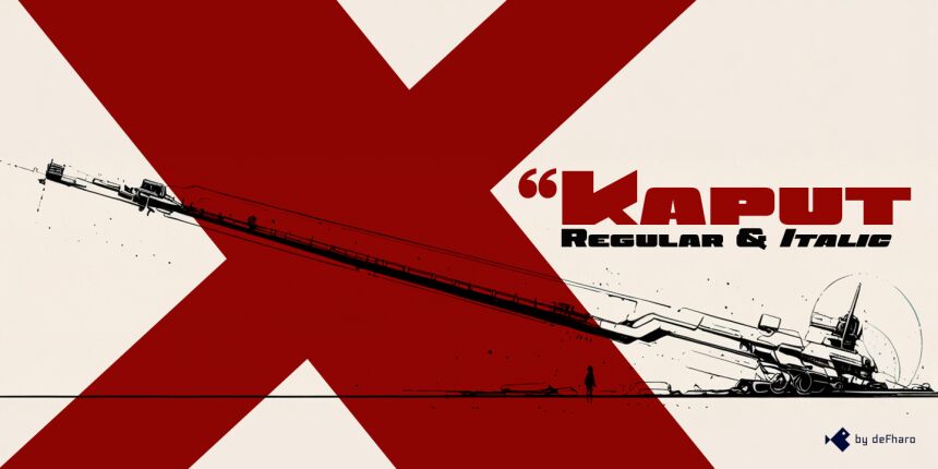
Kaput Black, a unique, heavy uppercase typeface, is here to create great titles and high-impact visual communication.
Kaput Black is designed with a perfect balance between strength and sophistication, it is bold, semi-expanded and spectacularly legible, the thick lines and horns with marked contrasts, which not only catch the eye, but also provide real harmony, thanks to the meticulous work of metrics and kerning.
Available in Regular and Italic versions with a 20-degree tilt that adds dynamism, modernity and technology.
=========================
DOWNLOAD FULL VERSIONS & LICENSES: https://defharo.com/fonts/kaput/
=========================
Mapa de caracteres
Porfavor use o menu suspenso para ver os diferentes mapas de caracteres contidos nesta fonte.

Informaçőes de fontes básicas
Nota de direitos autorais
Copyright (c) 2024 by deFharo. All rights reserved.
Família da fonte
Kaput Black Black
Subfamília da fonte
Regular
Identificação única da subfamília
Version 2.244;DFHA;KaputBlack;2024;FL842
Nome completo da fonte
Kaput Black
Versão da tabela de nomes
Version 2.244
Nome da fonte do postscript
KaputBlack
Nota da marca registrada
Kaput Black is a trademark of deFharo.
Nome do fabricante
Designer
Descriçăo
Kaput Black, a heavy and unique uppercase typeface family, is here to revolutionize the way we conceive great titles and high-impact visual communication.
Kaput is designed with a perfect balance between strength and sophistication, it is bold, semi-expanded and spectacularly legible, the thick lines and horns with marked contrasts, not only capture attention, but also provide meticulous harmony, thanks also to a thorough work on metrics and kerning.
Available in Black and Black Italic versions, the 20-degree inclination of the italic version adds a touch of dynamism and modernity.
Informações da fonte estendida
Plataformas suportadas
PlataformaCodificaçăo
UnicodeUnicode 2.0 e semântica em diante, Unicode BMP só.
MacintoshRomano
MicrosoftUnicode BMP só
Detalhes da fonte
Criado2024-11-24
Revisăo2
Contagem de glifos243
Unidades por Em1000
Direitos de IncorporaçăoIncorporação restrita (não é permitida!)
Classe da famíliaSem serifa
PesoUltra-negrito
AmplitudeExtra-expandida
Estilo para MacNegrito
EndereçoApenas glifos fortemente da esqueda para a direita + neutros
Padrăo naturalRegular
AfastamentoNăo monoespaçado