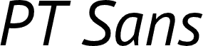
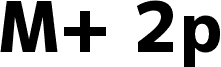
PT Sans Bold, designed by A. Korolkova, O. Umpeleva, and V. Yefimov of ParaType Ltd, is a free bold sans serif with a sturdy, contemporary build. Broad strokes and clean edges give the letters an immediate, practical look. Gently rounded curves soften the otherwise dense silhouette across the design.
The clear forms suit public signage and information graphics, yet the substantial weight also lends authority to packaging and event posters. It is particularly effective for editorial cover lines.
PT Sans is a type family of universal use. It consists of 8 styles: regular and bold weights with corresponding italics form a standard computer font family; two narrow styles (regular and bold) are intended for documents that require tight set; two caption styles (regular and bold) are for texts of small point sizes. The design combines traditional conservative appearance with modern trends of humanistic sans serif and characterized by enhanced legibility. These features beside conventional use in business applications and printed stuff made the fonts quite useable for direction and guide signs, schemes, screens of information kiosks and other objects of urban visual communications.
The fonts next to standard Latin and Cyrillic character sets contain signs of title languages of the national republics of Russian Federation and support the most of the languages of neighboring countries. The fonts were developed and released by ParaType in 2009 with financial support from Federal Agency of Print and Mass Communications of Russian Federation. Design - Alexandra Korolkova with assistance of Olga Umpeleva and supervision of Vladimir Yefimov.
Informações detalhadas do tipo de letra
Plataformas suportadas
PlataformaCodificação
UnicodeUnicode 2.0 e semântica em diante, Unicode BMP só.
MacintoshRomano
MicrosoftUnicode BMP só
Detalhes do tipo de letra
Criado2010-12-22
Revisão2
Número de glifos720
Unidades por em1000
Direitos de incorporaçãoIncorporação para instalação permanente
Classe da famíliaSem serifa
EspessuraNegrito
LarguraMédio (normal)
Estilo MacItálico
DireçãoApenas glifos fortemente da esqueda para a direita + neutros