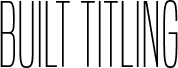
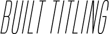
Built has one job: making solid, compact headlines onscreen. Designed with trust and neutrality in mind, Built's wraparound shapes speak your headlines in newsy voice. Subtle curls conjure a feeling of a different news era while not coming across as particularly old-fashioned.
The Built family comes in five weights, from extra-light to bold. But not your typical thin to fat linear range. When you're designing for the screen, there are practical limitations with light fonts. These days, with variable resolutions and screen sizes, going lighter means going bigger. Much bigger. And it's no fun if your words end up falling off the line. Built actually gets narrower as it gets lighter. Now you can can scale way up and still have room to spare. Set attractive, oversize page titles without worrying if the words will fit.
Tabular (monospace) numerals are handy when you have lists of numbers to align. In headlines, tabular numerals don't look so hotand they waste space. Lots of fonts let you choose between proportional and tabular numerals. OpenType technology lets designers access different types of numerals, but implementing OpenType features on the web isn't always practical. Built has a simple solution: if you turn off hinting, numerals, monetary symbols and most math symbols line up. Easy.
Built has fractions, primes, numeric ordinals, compact accents, the Indian rupee and the Turkish lira. As Built loses weight, its asterisk sprouts more legs, retaining it's presence even in Extra-Light. The italics are squeezed thin and loosened up on the sides, creating cool emphasis that's more than just a slant.
Built is available in Extra-Light, Light, Regular, Semi-Bold and Bold plus italics.
For a version with lowercase, check out the regular Built family.
http://typodermicfonts.com/built-for-headlines/
These fonts include a license that allows free commercial use: sometimes referred to as a desktop license. This allows you to install the fonts on a computer and use them to create posters, web graphics, game graphics, t-shirts, videos, signs, logos and more. Read the license agreement for details.
If you'd like to embed these fonts in an app, ebook, on the web or anything that's not covered by the desktop license agreement, visit the link below. You'll find distributors who offer different types of licenses or you can contact me for help.
http://typodermicfonts.com/built-titling/