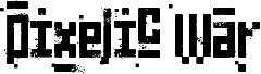
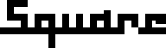
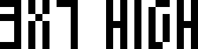
Ancient G Modern, de Gen Aris, é uma fonte bitmap pixelada gratuita com um carácter austero e futurista. Construída com traços retangulares robustos, cortes quadrados e cantos abruptos, as letras lembram sinalética codificada traduzida através de um ecrã de computador antigo.
A sua geometria rígida é ideal para interfaces de jogos, cartazes de ficção científica, artes visuais de música eletrónica e gráficos para eventos tecnológicos. Esta fonte gratuita funciona melhor em títulos curtos ou cartões de apresentação, onde as aberturas invulgares e as formas de blocos entrelaçadas têm espaço suficiente para se destacar sem perder o seu ritmo estranho e monumental.
--
Ancient G Modern é uma extensão do conjunto de glifos SGA/SG1 ANCIENT canon que oferece uma fonte mais completa. Inclui distinção de caixa, pontuação e caracteres estendidos.
Dúvidas ou comentários podem ser enviados para
genaris at gmail dot com
by Gen Aris -Inspired by fan fonts Anquietas, Alteran, & my personal prefs . . .
Família da fonte
Ancient G Modern
Subfamília da fonte
Regular
Identificação única da subfamília
Ancient G Modern:Version 1.00
Nome completo da fonte
Ancient G Modern
Versão da tabela de nomes
Version 1.00 September 26, 2008, initial release
Nome da fonte do postscript
AncientGModern
Nota da marca registrada
FANS are welcome to USE or MODIFY at will but please RENAME any modified versions you may create as to avoid confusion. :)
Nome do fabricante
Gen Aris
Designer
Gen Aris
Descriçăo
A variant of the ANCIENT glyphsets used by the Ancients in Stargate: Atlantis.
The purpose with this revision is to CREATE PUNCTUATION and ADDITIONAL CHARS/SYMBS to facilitate better clarity when applying this font to English documents which contain punctuation and other characters.
Per show canon, the Ancients did not appear to use punctuation marks, nor did they distinguish between Upper/Lower case. Again, to facilitate use of this font in regular documents or even as the Windows font (for menus etc) I have created CAPITALIZED VARIANTS which are identical to the lower case except I added a SQUARE DOT FLOATING ABOVE TOP LEFT of CAPPED KEYS. Passwords and user names sometimes use L/case and U/case letters, so it is necessary to distinguish the 2 cses in daily life here on Earth!
My logic for the design of new characters is as follows:
Letters are made up of white/black blocked spaces dividing on a 3 wide by 4 high grid. A few letters make use of subdivsions within the grid.
In canon, all numerals share a centered descender "tail" unlike the letters.
I took this further, by giving all punctuation mark glyphs a centered ascender on top, like an upside down version of the numeral tail -- an "antenna" if you will. This should make it easier to become facile at visually distinguishing punctuation marks from letters or numbers.
Some punctuation marks or symbols are used in numeric/math contexts partly or wholly. So, math or number oriented and shared alphanumeric/math punctuations are given the "tail" of numerals and the "antenna" of punctuation/symbols to so indicate the context.
The numbers, in canon, have a slightly more subdivided or even an altered grid used in their design than do the letters. Here, as well, both numbers and punctuation/symbols share this more prominent use of subdivision or underlying grid different from the letter glyphs.
Overall, I tried to adhere to the digital, techno-sensibility of the glyphs as seen in SG-1 and SGA while striking a balance with variations of weight and tone so as to be reasonably attractive, while remaining aware of the need to make this practical and functional. How well I fared toward my goals, I leave to you to decide. :)
Gen Aris genaris@gmail.com
Informações detalhadas do tipo de letra
Plataformas suportadas
PlataformaCodificação
UnicodeUnicode 2.0 e semântica em diante, Unicode BMP só.
MacintoshRomano
MicrosoftUnicode BMP só
Detalhes do tipo de letra
Criado2008-09-27
Revisão1
Número de glifos121
Unidades por em1000
Direitos de incorporaçãoIncorporação para instalação permanente
Classe da famíliaSem classificaçăo
EspessuraMédio (normal)
LarguraExtra-condensada
Estilo MacNegrito
DireçãoApenas glifos fortemente da esqueda para a direita + neutros